Important
This ShakeMap 3.5 Manual is deprecated. Please see the ShakeMap 4 Manual.
2.6. Representing Macroseismic Intensity on Maps
Wald et al. (1999b) relates recorded ground motions to Modified Mercalli Intensities in California. While not the first work of its type, Wald et al. had the advantage of using several earthquakes that were both very well surveyed for MMI, and also well instrumented for recorded ground motions. By relating the ground motions to MMI, Wald et al. made possible the rapid calculation of expected intensities from recorded ground motions. These “instrumental intensities” could be interpolated over an area and represented on a map.
As part of the original implementation of ShakeMap, Wald, et al. (1999a) developed a color scale to represent expected intensities over the mapped area. This scale gives users an intuitive, easy-to-understand depiction of the ground shaking for a given earthquake. By mapping intensity to color, we also make the hardest-hit areas stand out for emergency responders and members of the media. Along with the color scale, we developed simplified two-word descriptions of the felt intensity as well as the likely damage. These abridged descriptions are not meant to replace more comprehensive descriptions provided in the MMI (e.g., Dewey et al., 2000; Dewey et al., 1995), or EMS-98 (Grunthal et al., 1998) scales; however, they offer convenient description for our purposes.
By relating recorded peak ground motions to Modified Mercalli Intensities, we can generate instrumental intensities within a few minutes of an earthquake. In the current ShakeMap system, these instrumental intensities can be combined with direct measures of intensity (from “Did You Feel It?”, for example) and interpolated across the affected area. With the color-coding and two-word text descriptors, we can adequately describe the associated perceived shaking and potential damage consistent with both human response and damage assessments of past earthquakes to characterize the shaking from just-occurred earthquakes.
2.6.1. Color Palette for the ShakeMap Instrumental Intensity Scale
The color coding for the Instrumental Intensity map uses a standard rainbow palette (see Table 1.1). The “cool” to “hot” color scheme is familiar to most and is readily recognizable, as it is used as a standard in many fields (for example, see USA Today’s daily temperature maps of the U.S.). Note that we do not believe intensity II and III can be consistently distinguished from ground-motions alone, so they are grouped together, see Figure 1. In addition, we saturate intensity X+ with dark red; observed ground motions alone are not sufficient to warrant any higher intensities, given that the available empirical relationships do not have any values of intensity greater than IX. In recent years, the USGS has limited observed MMIs to IX, reserving intensity X for possible future observations (see Dewey et al., 1995, for more details); the USGS no longer assigns intensity XI and XII. We note that there were only only two intensity-IX assignments for the 1994 Northridge earthquake (Dewey et al., 1995), and only two or three proper intensity-IX assignments for the 1989 Loma Prieta earthquake (J. Dewey, 2015, personal communication).
Intensity |
Red |
Green |
Blue |
Intensity |
Red |
Green |
Blue |
|---|---|---|---|---|---|---|---|
0 |
255 |
255 |
255 |
1 |
255 |
255 |
255 |
1 |
255 |
255 |
255 |
2 |
191 |
204 |
255 |
2 |
191 |
204 |
255 |
3 |
160 |
230 |
255 |
3 |
160 |
230 |
255 |
4 |
128 |
255 |
255 |
4 |
128 |
255 |
255 |
5 |
122 |
255 |
147 |
5 |
122 |
255 |
147 |
6 |
255 |
255 |
0 |
6 |
255 |
255 |
0 |
7 |
255 |
200 |
0 |
7 |
255 |
200 |
0 |
8 |
255 |
145 |
0 |
8 |
255 |
145 |
0 |
9 |
255 |
0 |
0 |
9 |
255 |
0 |
0 |
10 |
200 |
0 |
0 |
10 |
200 |
0 |
0 |
13 |
128 |
0 |
0 |
Table 1.1 Color Mapping Table for Instrumental Intensity. This is a portion of the Generic Mapping Tools (GMT) “cpt” file. Color values for intermediate intensities are linearly interpolated from the Red, Green, and Blue (RGB) values in columns 2-4 to columns 6-8.
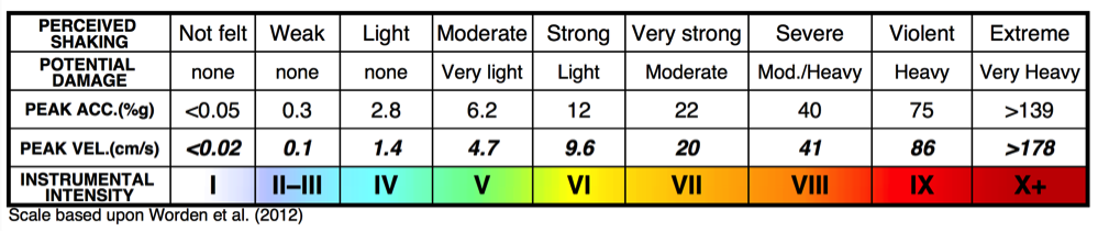
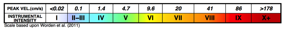
Figure 1: Top: ShakeMap Instrumental Intensity Scale Legend: Color palette, two-word text descriptors, and ranges of peak motions for Instrumental Intensities. Note that the peak motions are applicable to Worden et al. (2012); other Ground Motion/Intensity Conversion Equations use the same color scale, but their ranges of peak motions will differ. Bottom: Legend below PGV ShakeMap. The legend for below each ShakeMap is now map (parameter-) and GMICE-specific as labeled. Color-coding of stations corresponds to their intensity the GMICE (ground motion/intensity) relationship.
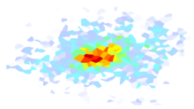
We drape the color-coded Instrumental Intensity values over the topography to maximize the information available in terms of both geographic location and likely site conditions. Topography serves as a simple yet effective proxy for examining site and basin amplification, but we recognize that many users do not necessarily benefit intuitively from having topography as a basemap.
2.6.2. ShakeMap Instrumental Intensity Scale Text Descriptions
The estimated intensity map is usually wholly or partially derived from ground motions recorded by seismic instruments, and represents intensities that are likely to have been associated with the recorded ground motions. However, unlike conventional intensities, the instrumental intensities are not based on observations of the earthquake’s effects on people or structures. The terms “perceived shaking” and “potential damage” in the ShakeMap legend are chosen for this reason; these intensities were not observed, but they are consistent on average with intensities at these ranges of ground motions recorded in a number of past earthquakes (see, for example, Wald et al., 1999b; Worden et al., 2012). Two-word descriptions of both shaking and damage levels are provided to summarize the effects in an area; they were derived with careful consideration of the existing descriptions in the Modified Mercalli definitions (L. Dengler and J. Dewey, written communication, 1998, 2003).
The ShakeMap qualitative descriptions of shaking are intended to be consistent with the way people perceive the shaking in earthquakes. The descriptions for intensities up to VII are constrained by the work of Dengler and Dewey (1998), in which they compared results of telephone surveys with USGS MMI intensities for the 1994 Northridge earthquake. The ShakeMap descriptions up to intensity VII may be viewed as a rendering of Dengler and Dewey’s Figure 7a.
The instrumental intensity map for the Northridge earthquake shares most of the notable features of the Modified Mercalli map prepared by the USGS (Dewey et al., 1995), including the relatively high intensities near Santa Monica and southeast of the epicenter near Sherman Oaks. However, in general, the area of intensity IX on the instrumentally derived intensity map is slightly larger than on the USGS Modified Mercalli intensity map. This reflects the fact that although much of the Santa Susanna mountains, north and northwest of the epicenter, were very strongly shaken, the region is also sparsely populated, hence, observed intensities could not be determined there. This is a fundamental difference between observed and instrumentally derived intensities: instrumental intensities will show high levels of strong shaking independent of the exposure of populations and buildings, while observed intensities only represent intensities where there are structures to damage and people to experience the earthquake.
The ShakeMap descriptions of felt shaking begin to lose meaning above intensity VII or VIII. In the Dengler and Dewey (1998) study, peoples’ perception of shaking began to saturate in the VII-VIII range, with more than half the people at VII-VIII and above reporting the shaking as “violent” (on a scale from “weak” to “violent”). In the ShakeMap descriptions, we intensified the descriptions of shaking with increases of intensity above VII, because the evidence from instrumental data is that the shaking is stronger. But we know of no solid evidence that one could discriminate intensities higher than VII on the basis of different individuals’ descriptions of perceived shaking alone.
ShakeMap is not unique in describing intensity VI as corresponding to strong shaking. In the 7-point Japanese macroseismic scale, for which intensity 4 is equivalent to MMI VI, intensity 4 is described as “strong.” In the European Macroseismic Scale (Grunthel et al., 1998) (EMS-98), which is compatible with MMI (Musson et al., 2010), the bullet description of intensity V is “strong.” Higher EMS-98 intensities are given bullet descriptions in terms of the damage they produce, rather than the strength of perceived shaking.
2.6.3. ShakeMap Intensity Scale and Peak Ground Motions
The ShakeMap Instrumental Intensity Scale Legend provides the PGA and PGV associated with the central value in each intensity box (see Figure 1). For all current GMICEs, the ground motion scale is logarithmic, with an increase of one intensity unit resulting from approximately a doubling of peak ground motion. Nevertheless, each GMICE has its own mapping of ground motion to intensity, and thus the values shown in the scale legend can vary, depending on the GMICE chosen for the map in question. To avoid confusion, the legends now have a citation in the lower left specifying which GMICE was used to produce the map and scale. Note, however, that while the mapping of ground motion to intensity varies, the mapping of color to intensity remains the same for all maps.
We note that the ShakeMap legends (e.g., Figure 1) have evolved slightly from the earlier version of ShakeMap and the 2005 ShakeMap Manual. The PGMs tabulated are no longer provided by (previously redundant) PGM ranges, but rather by the median motions associated with the intensity on the scale.
2.6.4. Color Coding Stations by Intensity
Traditionally, stations on the PGM ShakeMaps were color-coded to the seismic network that provided them. More recent versions of ShakeMap, however, allow the operator to color the stations with the intensity they produced, with each PGM parameter (e.g., PGA, PGV, PSA03) using its own intensity correlation. Figure 2 (and many of the other figures throughout this guide) illustrates the color coding of stations by their intensity values for several parameters. The operator can elect this option by calling the program mapping with the flag -pgminten.
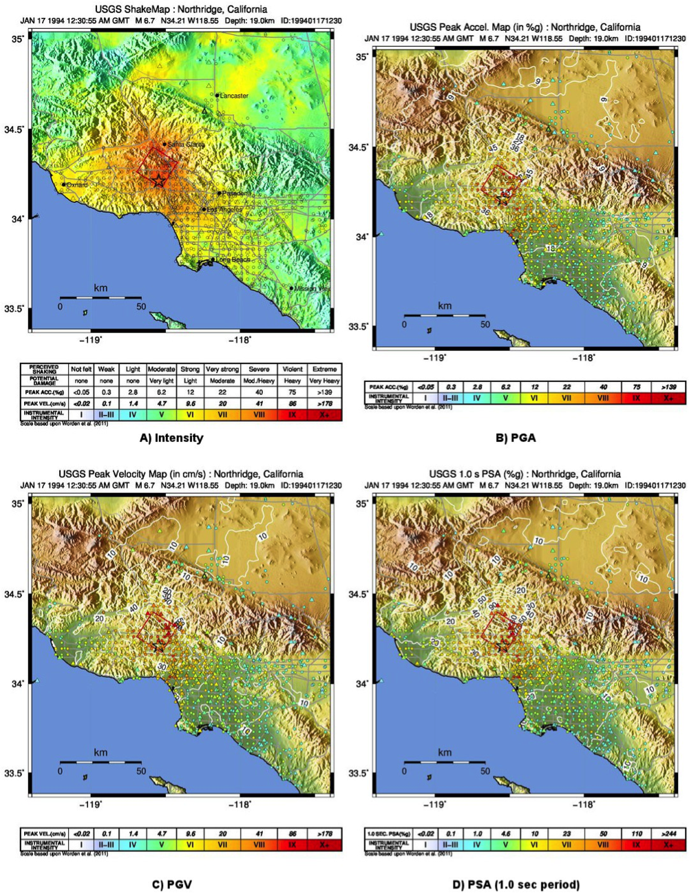
Figure 2: ShakeMap for the 1994 M6.7 Northridge, CA earthquake with a finite fault (red rectangle), strong motion data (triangles) and intensity data (circles). Stations and macroseismic data are color coded according to their intensity value, either as observed (for macroseismic data) or as converted by Worden et al. (2011) and indicated by the scales shown. Note: Macroseismic data do not change colors from map to map, but seismic stations do, since the estimated intensity conversion depends on which parameter is used.